
You are currently browsing the category archive for the ‘cover art’ category.
The You I Never Knew was written, sold to a publisher, and edited…and then it was orphaned. In publishing, this means the editor who acquired it moved on while the book was in production. This is usually not the best news for a book, because that acquiring editor loved the book and was its in-house cheerleader. The project was handed off to a new editor. This is a bit like getting a foster child you didn’t ask for.
In my case, it turned out to be a mixed blessing. They were right in the middle of designing the cover, and it looked like this:

the art i never used on the you i never knew

literary collection of stories
Now, this is a fine piece of original art. The design and layout are reminiscent of both The Horse Whisperer and a Nicholas Sparks cover, so those are pluses. It also looks a bit like Annie Proulx’s Close Range.
Does this mean the cover is right for this book? Probably not. First of all, The You I Never Knew would be a paperback original, not a hardcover book, so the art needs to “pop” on the shelf in order to stand out. The colors of this cover are muted and the mood is chilly. It might work on a hardcover jacket, but it doesn’t look instantly warm and inviting, like a “feel-good” novel.
The new editor came into the middle of cover design, knowing nothing about me or the book. There was a bright spot, though. The new editor was the extremely smart Maggie Crawford, and she was the kind of foster mother the book needed–an experienced editor who understood the market for this book. She’d worked with many bestselling authors and had a fine eye for marketing women’s fiction. She took on the cover art issue with aplomb, and came up with this.
 It’s one of the least-relevant yet most commercial covers I’ve ever had. Here’s my analysis: Splashing my name on the cover in huge letters gave the illusion that this was a big book by a big author. The lettering itself–big, graceful block lettering–was reminiscent of the font used for blockbuster author Sandra Brown.
  And of course, it capitalizes on the galloping popularity of the biggest novel of the ’90s, The Horse Whisperer.
So I’m back on track, right? My new editor rescued the novel from obscurity and now all I’d need to do is kick back and let the sales roll in. Oh, and I’d be working with Maggie on the next book, brainstorming the plot and building on the success of The You I Never Knew. Right? Right?
NOT.
The lovely and talented foster-editor for this book was so lovely and talented that another publisher hired her away. By the time my novel was published for the first time, there was no one home. My calls were fielded by hapless assistant. With no in-house cheerleader, no marketing budget, and no PR, my book was destined to die of slow strangulation in that publishing twilight zone known as “the midlist.” If sales were poor, the publisher wouldn’t want anymore books from me, and my days as an author were numbered.
BUT.
I had a secret weapon, and that secret weapon was YOU. The You I Never Knew, aka READERS.
One of the great things about publishing is that readers don’t care what a book’s marketing budget is. They don’t care how it’s positioned on a publisher’s list or catalog. They care about the story. Not only that, when they like the story, they tell their friends. And their librarians. And their hairdresser. And the next thing you know, the book is a bestseller.
Against all odds, the first edition of The You I Never Knew made the USA Today bestseller list. Thanks to readers, the book is still in print, in a fresh new edition this week.

The latest edition – in stores now!

the 2010 edition
Here is the final tweaked version. Coming to bookstores everywhere September 26.
Oh, and our good buddy Dan has a new book coming out, too, in case you haven’t heard. They’ve unveiled his cover today, too:

Whatcha think?
So as you well know by now, I am obsessed by book covers. It’s all part of my obsession with books. Now I need your opinion on an upcoming cover. Just Breathe has a strong, sophisticated cover, clean and light, with a single evocative image:

it was a bestseller
Next hardcover is Lakeshore Christmas. Marketing-wise, this cover has a big job to do. It needs to straddle the line between a hardcover and the Lakeshore paperbacks. It needs to attract readers who have never heard of me but who might want to give it a try. It needs to be memorable. It currently looks like this:

it wants to be a bestseller
The shot above is an early mockup that was sent. The title is wrong (no “A”) but the general idea is there. Next we saw the full jacket. I’m sure I don’t have to tell you what I think of Barkis’s star turn:

book jacket laid flat
There are a couple of tweaks. The title script is nicer, I think, though my agent wanted my name bigger. There’s a #1 in front of “New York Times” which makes me proud and could be a selling point. I don’t love the text at the very top and hope they’ll move that. It looks cluttered, and remember, we want this to appeal to people who haven’t yet discovered the series, so it’s not much of a hook and might be off-putting to people who don’t want to read a book out of order.
The Lakeshore Chronicles have a “look”–small-town charm in miniature. In that sense, this cover works. It’s a pretty image, too. Reminds me of those little collectible Christmas villages. No complaints about that. The question is, will it stand out? When you view Just Breathe from across the bookstore, the image grabs your attention. The Christmas cover…maybe not. My concern–the eye doesn’t know where to go. To the couple on the bench? The gazebo? There isn’t something strong, standing out. Up against all the other books on the shelf, it might end up looking like wallpaper. At this point, it probably can’t be radically changed, but there could be some tweaking. My thought is maybe they could bring up the light around part of the image–maybe the gazebo and tree?–to give book browsers something to focus on. Better yet, it needs to look like something they want to take home with them. C’mon, put on your art-director hat and chime in.
wonderful book, awful cover
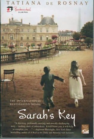
[Synchronicity–CNN is talking about book covers today, too! ] As we all know, I am endlessly fascinated by book cover art. I’ve talked about it here, and here, too. A story in Publishers Weekly illustrates the power of a great package. Sarah’s Key by Tatiana de Rosney was one of my favorite books of 2008. The novel garnered rave reviews, incredible word-of-mouth, excellent foreign sales…and a disappointing sale of 6000 copies in the US. Guess why?
Need I say more? Where do I begin? With the pale re-use of an iconic image from a previous bestseller? http://ecx.images-amazon.com/images/I/51TDTNS7HZL._BO2,204,203,200_PIsitb-sticker-arrow-click,TopRight,35,-76_AA240_SH20_OU01_.jpg With the undistinguished font? The murky colors? The ambiguous imagery and mixed message? No wonder readers overlooked this poor book.
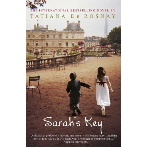
But this is why I love book people. When their passion for a project kicks in, there’s no stopping them. According to Publishers Weekly, http://www.sarahskey.com/article-24703998.html the book’s publisher stepped in and had the book repackaged in trade paperback format, with a thoughtful and intriguing new cover: http://idata.over-blog.com/0/51/68/46/sarah-bis/SKUSA.jpg featuring an irresistible blurb from Augustin Burroughs. Oh, and a new price point, don’t forget that. The result? Sales leaped up to 185,000–making this book a legitimate bestseller and giving the author the happy ending she deserves.
Need I say more? Where do I begin? With the pale re-use of an iconic image from a previous bestseller?
wonderful book, cover that did it justice
With the undistinguished font? The murky colors? The ambiguous imagery and mixed message? No wonder readers overlooked this poor book. A wonderful novel deserves better, don’t you think?
But this is why I love book people. When their passion for a project kicks in, they’re willing to regroup and try again. According to Publishers Weekly, the book’s publisher stepped in and had the book repackaged in trade paperback format, with a well thought-out and intriguing new cover and an irresistible blurb from Augustin Burroughs. Oh, and a new price point, don’t forget that. The result? Sales leaped up to 185,000 (and counting)–making this book a legitimate bestseller and giving the author the happy ending she deserves.
Soooo…I will try to post my summer reading here, but I’m very lazy about broadcasting what I’m reading, because I read so much!
But this is a novel you won’t want to miss. Heartbreak and redemption and a little-known (to Americans) bit of WWII horror. A must for book clubs!

Ah! Success!
The highlight of Book Expo is, of course, the Advance Reading Copies–ARCs. These are review copies of upcoming books and I tried not to be greedy, but here are a few finds:
Favorite concept book: Pat the Husband patterned after the children’s classic “Pat the Bunny”
Most hotly anticipated new book: Love Matters by Delilah, a syndicated radio host. I knew I was goig to like Delilah. Like most other parents on the planet, I used to have to force myself to stay awake while waiting for my teenaged daughter to get home from her weekend outtings. In order to keep the imagination from going overboard, I used to listen to Delilah’s soothing voice and music choices on the radio. She was my Friday and Saturday night comfort fix. And now she has a book. I’m thinking it’s a lot higher on my list than the Miley Cyrus book.
Most massive hit du jour: Twenty Wishes by Debbie Macomber. I remember reading in Publishers Weekly, years ago, that LaVyrle Spencer’s print runs in hardcover were in the 400,000 range, which is massive. Very few writers get to that point. According to a more recent PW, Debbie has reached that pinnacle. Incredible achievement, well deserved, by the one of the nicest and hardest-working writers I know.
Hottest middle-grade children’s book at the show: Fortune’s Magic Farm by Suzanne Selfors.
Hottest debut novel: Oxygen by Carol Cassella.
Anti-climactic “reveal”: the cover art for the next Stephenie Meyer book. It’s a chessboard, very handsome but not as much of a showstopper as the first three, IMO.
Cutest cover: Dewey, the Small-Town Library Cat. WARNING: It’s a pet memoir, okay? And everybody knows pet memoirs all end the same. So get out the duct tape and seal the last couple of chapters shut. Unless you like that sort of thing. Unless you like hitting yourself in the head with a hammer.
Best Lemony Snicket knock-off: Pseudonymous Bosch. A knock-off doesn’t necessarily have to be bad, and in this case it’s irresistibly good! In fact, I liked this even better than the Lemony Snicket series.
Most relaxing-looking cover: Off Season by Anne Rivers Siddons.
Most forbidding-looking cover: Testimony Anita Shreve. A real hot-button storyline, too. I’m a sucker for boarding-school books. No idea why, but I am.


I have a chute signing with ARCs of my September book, with my perfectly-dressed-in-polka-dots editor. She gets to hear 40-umpteen people say, “Oooh, my mother loves your books!” Big crowds for Ridley Pearson & Dave Barry, Lois Lowry, Sherman Alexie…
 New Rule: Do not wear your adorable pink Gabriella Rocha heels on the mirror-slick convention hallway floors. (AKA the “what were they thinking?” floor surface) Nuff said.
Huge lines in the booths for Michael Connelly, who patiently signs at Hachette for a long time. Barbara Walters looks exactly like she looks on TV although she is tiny. TINY. Her line was probably the longest I saw.
Brooke Shields is so beautiful I doubt she’s human. Kirk Cameron (what show was he on?) has a book–a Christian memoir, I think.
I find Anne Rice in the Knopf booth so I can give her and her sister Karen a Just Breathe ARC. The book is dedicated to Anne’s other sister Alice Borchardt, who was in my first critique group. She was my mentor and friend for twenty-five years. She passed away in November and Just Breathe is dedicated to her. Anne looks lovely and it’s a short, emotional conversation.


